Featured

ABOUT ME

BUILDING MY BRAND IDENTITY 

Academic Background and Past Experiences

I am a senior at Illinois State University, working toward receiving my degree in Fashion Merchandising. Aside from being a full time student for four years, I have worked at Ulta Beauty for multiple years. I have gained retail knowledge and experience on customer service, communication, visual merchandising and many more attributes. Recently, I took on the Finance Intern role at Special Olympics Illinois where I was only a student worker. Being a Finance Intern has taught me valuable resources that will come in hand when working in business after graduation.

Strengths and Achievements

As a senior in high school, I dreamt of owning my own boutique one day. I decided to major in Business Management because I thought that was the only major possible with what I wanted. A few years into college, I discovered Fashion Merchandising as a major. Fashion Merchandising has had a positive effect on my career at ISU.  Since being in this major I have discovered many strengths about myself. I am persistent, strong willed, outgoing, and passionate about everything I put my mind to. All of these strengths will help me become the best fashion professional I can be.

Career Goals

I am passionate about business and have a love for fashion. Fashion merchandising was the perfect mix for me. I grew up admiring celebrities runway dresses, what they wore everyday and even to the gym. I admired girls who dressed like their personality. Fashion empowers women to conquer their goals and make changes in the world.  Aside from fashion and business, I am also passionate about fitness and athleisure wear. My biggest goals is to work for an athletic retail company like Adidas or Lululemon. I want to find out what customers are loving, buying and hating. I want to give them products that make feel empowered.

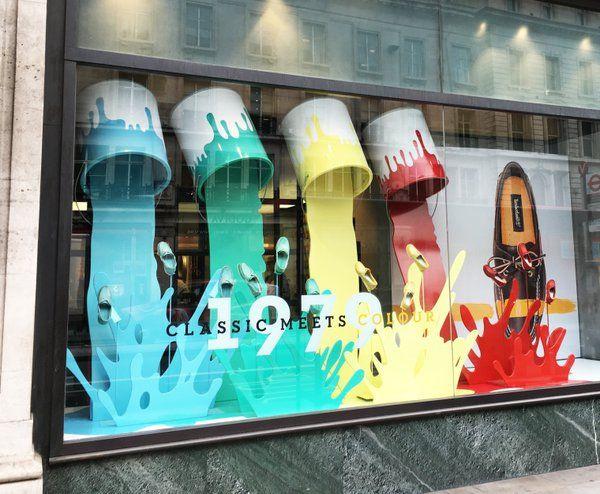
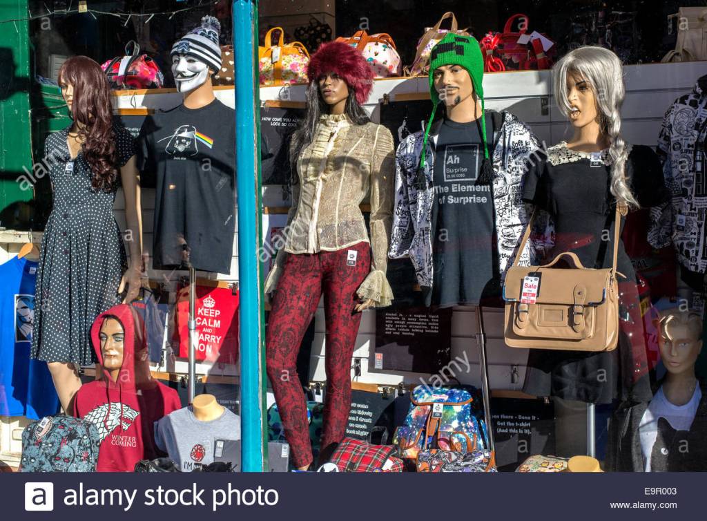
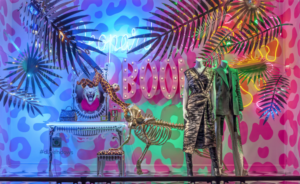
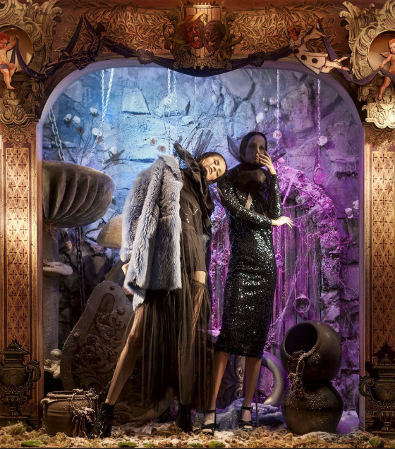
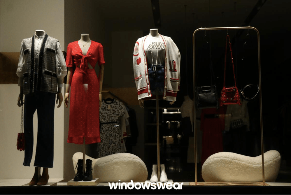
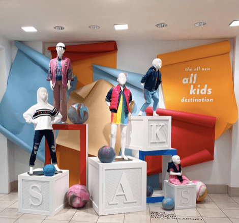
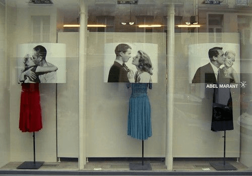
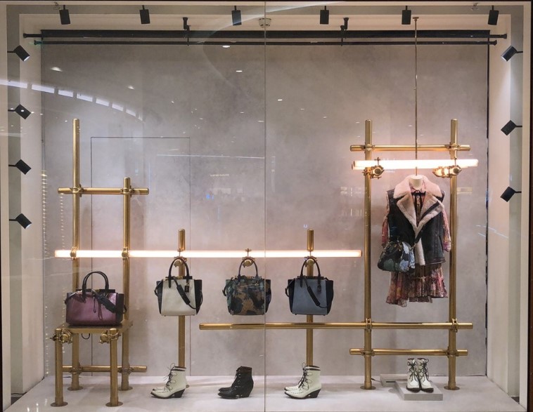
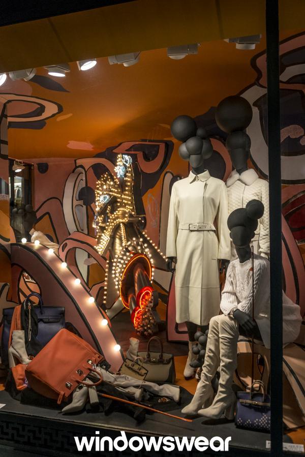
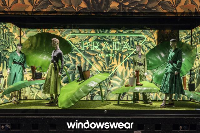
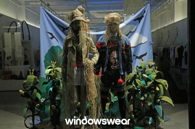
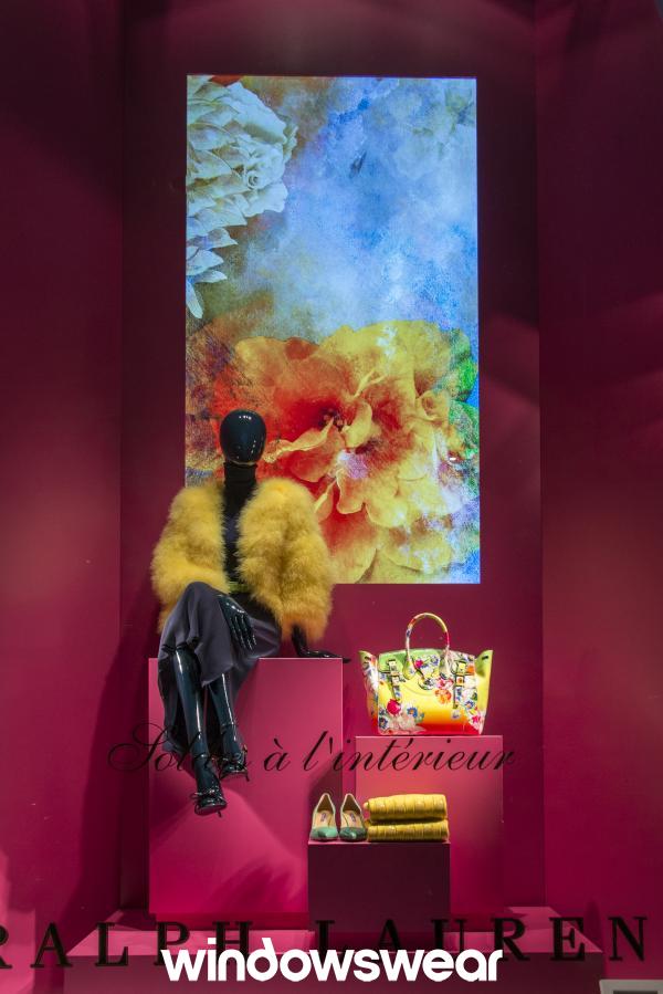
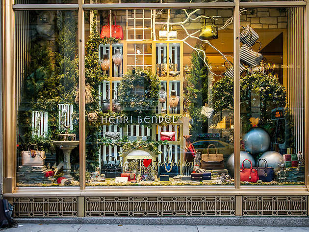
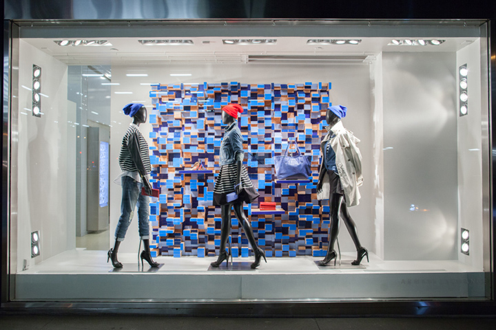
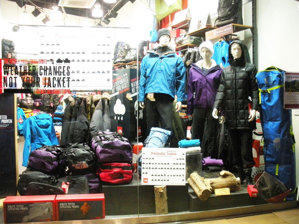
Visual Merchandising Analysis is an on going project throughout Spring Semester where I will display the information I have learned for Fashion Promotion 368. I will view and analyze a variety of different store window displays as well as post reflections. 

Visual Merchandising Analysis 8

The Good

This display is fun and vibrant. It catches my eye and makes me want to go into a store. The colors of the display are bold and bright and were chosen to go together perfectly. The paint splashes add movement to the display and helps enhance the shoes. This display is proportion perfectly with the props and the merchandise. They did a god job providing good amount of size to this display that made the whole display go together well. There was enough balance between the paint and the shoes. This whole display was enough to make a customer want to come in and buy merchandise.

The Bad

I don’t even know where to being with this window display. Messy and clutter is the only thing I see. It looks like they just though all their merchandise onto one window for customers to see what they have. When I look at this display it doesn’t want to make me go into a store and shop there. They need to take away some mannequins and some of the bars and other props and but some art work or something to add a creative aspect.

Visual Merchandising Analysis 7

The Good

This display is wow, out there, artsy, fun, energetic, bring a sense of wanting to go out in New York City. I love this display. There is a lot going on here but they did a good job at making sure it wasn’t too much. The color scheme of this is everything. It is bright neon and fun colors. Very 80s esthetic to me. The props add just enough to help enhance the merchandise but still keep you looking at the design. Everything comes together to help bring in harmony. There is rhythm in this display, it gives a sense of movement. I think this display is the perfect example of having surprise to it. If I saw this design, I would stop in my tracks to look at it. This display helped enhance the brand image and make customers want to go in.

The Bad

Confused is what I have to say. I don’t know if they are going for a halloween or day of the dead type of vibe. The props don’t make much sense to me. The clear theme isn’t seen when you look at it. This display looks mess to me and needs a lot of help. I wish it had a better color scheme. The lighting doesn’t help to enhance any merchandise, it seems it might’ve been placed at the wrong spot. I wish the probs were used to enhance the merchandise, it looks like they were just thrown around. There looks like there is just a lot going on and some things need to be removed so it is not so overwhelming to look at.

Visual Merchandising Analysis 6

The Good

I am so intrigued to look at the window design. I could stare at it for hours. It brings me a sense of a calm and clean environment. This display did a wonderful job with the accent lighting, it really brings out the merchandise. The color scheme is my favorite part. I love a neutral look, or monochromatic. Everything in this design comes to together and shows a great sense of unity. All of the displays and props provide a sense of texture. It makes you want to go into the store and touch the pillows or vases. This display has good proportion. The vases being different sizes along with the chair with pillows under the light fixture. This display brings you a sense of being at home or wanting that to be your home. If I was a customer I would walk into the store because of this display.

The Bad

Boring. All I have to say is boring. There is no wow factor to me. Just looks like I’m looking at mannequins. I will say they did a good job incorporating a color schemes of whites,blacks and red which is very sleek. But things are missing. There needs to be props, better lighting. Another mannequin would help to bring more rhythm when looking at it. This could be a good window but just needs a lot of love and attention for their visual merchandising team.

Visual Merchandising Analysis 5

The Good

This display is so appealing to children, it brings a fun and energetic vibe. The blocks give texture by being 3D. It also helps emphasis merchandise. I love how the blocks are white, it is a perfect neutral touch. The marble balls help add a sense of playfulness to the display as well as a good color touch. There isn’t too much going on in this display. The blocks are set up at different heights which helps create balance and harmony. There is a good amount of bright colors but also neutrals to help not be so overwhelming. This display very much appeals to me, as it would moms and children. This display is fun and very appropriate for a children’s store.

The Bad

As I am drawn to simple displays because simple is sometimes better but this display is too simple. It is boring to look at. The dresses only give us 3 colors to look at and they aren’t eye catching. The pictures above the dresses are cute and show a sense of love but it just confuses me how this fits into the display. There isn’t a clear theme. There needs to be more art displayed. There isn’t emphasis created on the merchandise. It is just a boring display that probably only took 10 minutes to do.

Visual Merchandising Analysis 4

The Good

This display is stunning. It has just a perfect touch of elegance but street style. The gold bars very much help enhance the merchandise. The bars are sleek and give just enough balance for the display. They help create direction and they are proportion just right. The colors of the merchandise are neutral with a few pops of color which I think helps not overwhelm a customer. The repetition is the white shoes is a nice touch. The shoes facing toward the left help with direction. The lighting helps create emphasis to the merchandise. This display is appealing to customers. It encourages be to go into the store and shop. This was an overall sleek and simple display that I enjoyed looking at.

The Bad

This display screams messy and clutter. I don’t know if the merchandise on the ground is supposed to be like that or if a prop broke but it is not attractive to look at. Looking at the mess it would make me not want to go into a store because the store has potential to be like that. The light fixtures are overwhelming and don’t appeal to me. There needs to be a better color scheme. More neutrals with a pop of color. I don’t like how all the mannequins are placed to the side of the window. I think everything could’ve been better placed. Overall, this display needs help in many aspects.

Visual Merchandising Analysis 3

The Good

This display is so intriguing to me. I first caught my eye when I saw how the props were used to enhance the merchandise. They aren’t normal props, they are huge leaves that somehow aren’t overwhelming to look at. It helps create emphasis on the shoes and purses that are being displayed. They took a jungle theme to a new level. I love how they enhanced every shade of green they good. There is unity and harmony among all the colors. The hints of neutral colors give it just enough balance. There is somehow a perfect contrast when looking at it. This display perfectly enhances Prada’s elegant but wild image. This display is creative, outside of the box and I could stare at it for hours and feel inspired.

The Bad

This display is far from good. It just looks messy and a little dirty to me. I can’t get a theme from this display. The mannequins used aren’t helping enhance the merchandising. The props such as the plants are just messing and don’t appeal to me or help create a theme. The backdrop is falling and looks like it was just put up fast. This display does not appeal to me as a customer and doesn’t push me to go into the store and shop around.

Visual Merchandising Analysis 2

The Good

This display first caught my eye by how elegant it is. I love how it uses the colors from the portrait in the back to match the garments that are being displayed. The colors are bright, young and make you dream of a spring day with the high intensity. There is just enough balance between the props and the merchandise. It isn’t too overwhelming or too bare. The props help create emphasis to the merchandise by displaying them at different level. This display helps enhance Ralph Lauren’s store image by showing us elegance, clean and crisp display.

The Bad

This display screams clutter. I am attracted to displays that are neat, balanced, and pleasant to the eye. There is a lot of negative space. One way they could improve is take out some of the purses or props. The props do not enhance the merchandise and thats what they should be doing. That would create more of a positive space. There isn’t a lot of balance. I feel as if there are just random things such as the tree branches in the back or the 2 big silver balls. There needs to be balance and harmony. The color scheme is lacking here also. They could do more neutral background with pops of colors using the purses. There doesn’t seem to be a theme that customers will see. I believe this display needs a lot of work to be appealing to customers.

Visual Merchandising Analysis 1

The Good

The window display above is featured at an Armani Exchange store in New York City. This display stuck out to me right away by the background. It shows the color blue and adds value to add a variety of blues. There is a strong unity between the mannequins and the display. There may be a lot going on but it has balance. It is clean and well thought out. It provides rhythm with the mannequins walking the same way. The props in the background are all placed at different levels but in balanced way which enhances the merchandise. Armani is a clean, crisp, designer brand and this display enhances the stores image.

The Bad

This display looks like it could be seen at a North Face Store or a Dick’s Sporting Goods. The first thing that throws me off while looking at the display is the clutter. There is way to much negative space. There needs to be more balance. There is random items placed throwout including the logs which don’t fit in. This display could improve simply by just grouping things together and putting out less items so it doesn’t look so cluttered. Also, there isn’t really a theme and the colors don’t flow together. This display won’t catch anyones eye or persuade someone to go into the store.

Introduce Yourself (Example Post)

This is an example post, originally published as part of Blogging University. Enroll in one of our ten programs, and start your blog right.

You’re going to publish a post today. Don’t worry about how your blog looks. Don’t worry if you haven’t given it a name yet, or you’re feeling overwhelmed. Just click the “New Post” button, and tell us why you’re here.

Why do this?

  • Because it gives new readers context. What are you about? Why should they read your blog?
  • Because it will help you focus you own ideas about your blog and what you’d like to do with it.

The post can be short or long, a personal intro to your life or a bloggy mission statement, a manifesto for the future or a simple outline of your the types of things you hope to publish.

To help you get started, here are a few questions:

  • Why are you blogging publicly, rather than keeping a personal journal?
  • What topics do you think you’ll write about?
  • Who would you love to connect with via your blog?
  • If you blog successfully throughout the next year, what would you hope to have accomplished?

You’re not locked into any of this; one of the wonderful things about blogs is how they constantly evolve as we learn, grow, and interact with one another — but it’s good to know where and why you started, and articulating your goals may just give you a few other post ideas.

Can’t think how to get started? Just write the first thing that pops into your head. Anne Lamott, author of a book on writing we love, says that you need to give yourself permission to write a “crappy first draft”. Anne makes a great point — just start writing, and worry about editing it later.

When you’re ready to publish, give your post three to five tags that describe your blog’s focus — writing, photography, fiction, parenting, food, cars, movies, sports, whatever. These tags will help others who care about your topics find you in the Reader. Make sure one of the tags is “zerotohero,” so other new bloggers can find you, too.

Design a site like this with WordPress.com
Get started