The Good
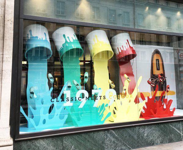
This display is fun and vibrant. It catches my eye and makes me want to go into a store. The colors of the display are bold and bright and were chosen to go together perfectly. The paint splashes add movement to the display and helps enhance the shoes. This display is proportion perfectly with the props and the merchandise. They did a god job providing good amount of size to this display that made the whole display go together well. There was enough balance between the paint and the shoes. This whole display was enough to make a customer want to come in and buy merchandise.
The Bad
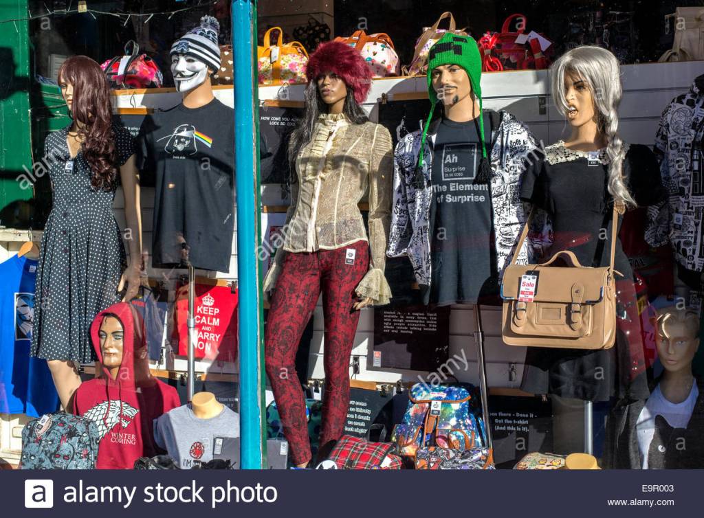
I don’t even know where to being with this window display. Messy and clutter is the only thing I see. It looks like they just though all their merchandise onto one window for customers to see what they have. When I look at this display it doesn’t want to make me go into a store and shop there. They need to take away some mannequins and some of the bars and other props and but some art work or something to add a creative aspect.
