The Good
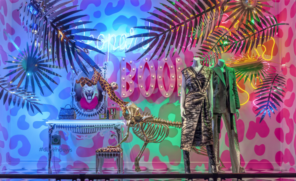
This display is wow, out there, artsy, fun, energetic, bring a sense of wanting to go out in New York City. I love this display. There is a lot going on here but they did a good job at making sure it wasn’t too much. The color scheme of this is everything. It is bright neon and fun colors. Very 80s esthetic to me. The props add just enough to help enhance the merchandise but still keep you looking at the design. Everything comes together to help bring in harmony. There is rhythm in this display, it gives a sense of movement. I think this display is the perfect example of having surprise to it. If I saw this design, I would stop in my tracks to look at it. This display helped enhance the brand image and make customers want to go in.
The Bad
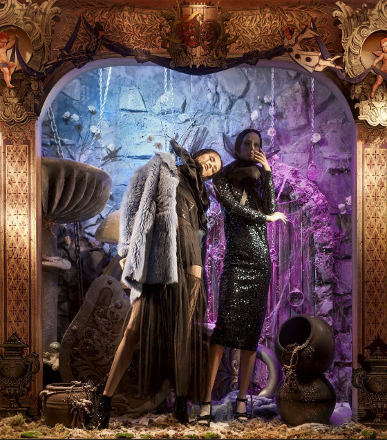
Confused is what I have to say. I don’t know if they are going for a halloween or day of the dead type of vibe. The props don’t make much sense to me. The clear theme isn’t seen when you look at it. This display looks mess to me and needs a lot of help. I wish it had a better color scheme. The lighting doesn’t help to enhance any merchandise, it seems it might’ve been placed at the wrong spot. I wish the probs were used to enhance the merchandise, it looks like they were just thrown around. There looks like there is just a lot going on and some things need to be removed so it is not so overwhelming to look at.
