The Good
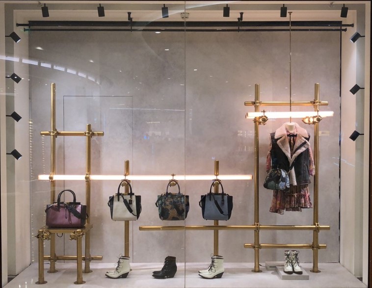
This display is stunning. It has just a perfect touch of elegance but street style. The gold bars very much help enhance the merchandise. The bars are sleek and give just enough balance for the display. They help create direction and they are proportion just right. The colors of the merchandise are neutral with a few pops of color which I think helps not overwhelm a customer. The repetition is the white shoes is a nice touch. The shoes facing toward the left help with direction. The lighting helps create emphasis to the merchandise. This display is appealing to customers. It encourages be to go into the store and shop. This was an overall sleek and simple display that I enjoyed looking at.
The Bad
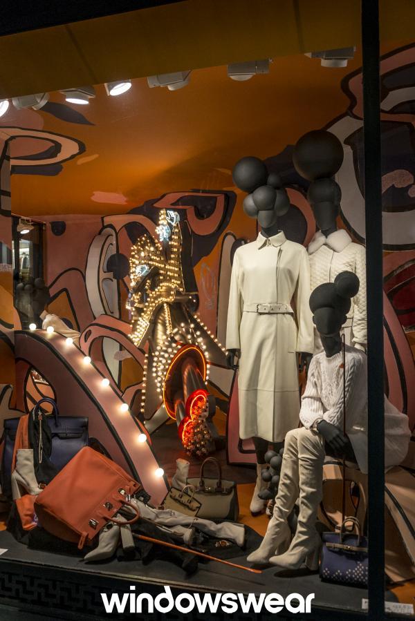
This display screams messy and clutter. I don’t know if the merchandise on the ground is supposed to be like that or if a prop broke but it is not attractive to look at. Looking at the mess it would make me not want to go into a store because the store has potential to be like that. The light fixtures are overwhelming and don’t appeal to me. There needs to be a better color scheme. More neutrals with a pop of color. I don’t like how all the mannequins are placed to the side of the window. I think everything could’ve been better placed. Overall, this display needs help in many aspects.
