The Good
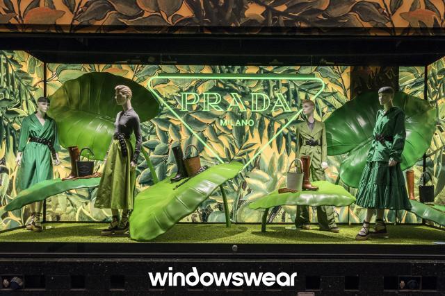
This display is so intriguing to me. I first caught my eye when I saw how the props were used to enhance the merchandise. They aren’t normal props, they are huge leaves that somehow aren’t overwhelming to look at. It helps create emphasis on the shoes and purses that are being displayed. They took a jungle theme to a new level. I love how they enhanced every shade of green they good. There is unity and harmony among all the colors. The hints of neutral colors give it just enough balance. There is somehow a perfect contrast when looking at it. This display perfectly enhances Prada’s elegant but wild image. This display is creative, outside of the box and I could stare at it for hours and feel inspired.
The Bad
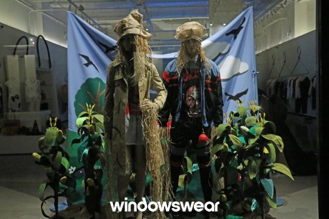
This display is far from good. It just looks messy and a little dirty to me. I can’t get a theme from this display. The mannequins used aren’t helping enhance the merchandising. The props such as the plants are just messing and don’t appeal to me or help create a theme. The backdrop is falling and looks like it was just put up fast. This display does not appeal to me as a customer and doesn’t push me to go into the store and shop around.
