The Good
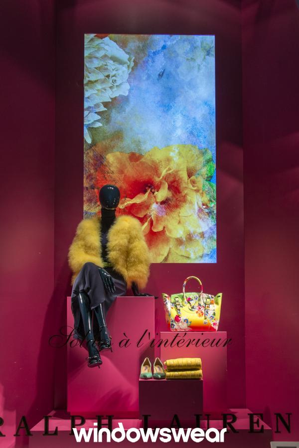
This display first caught my eye by how elegant it is. I love how it uses the colors from the portrait in the back to match the garments that are being displayed. The colors are bright, young and make you dream of a spring day with the high intensity. There is just enough balance between the props and the merchandise. It isn’t too overwhelming or too bare. The props help create emphasis to the merchandise by displaying them at different level. This display helps enhance Ralph Lauren’s store image by showing us elegance, clean and crisp display.
The Bad
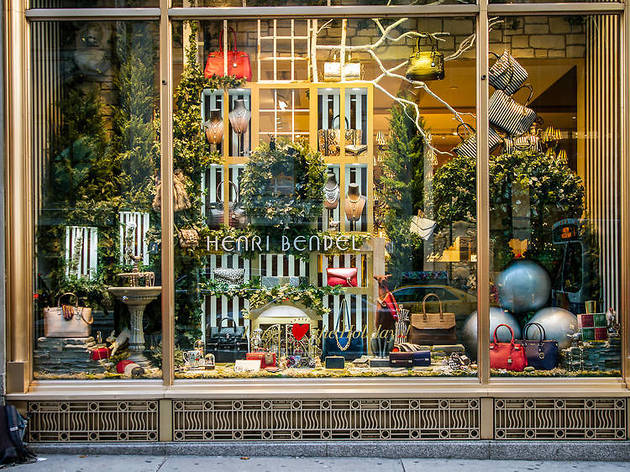
This display screams clutter. I am attracted to displays that are neat, balanced, and pleasant to the eye. There is a lot of negative space. One way they could improve is take out some of the purses or props. The props do not enhance the merchandise and thats what they should be doing. That would create more of a positive space. There isn’t a lot of balance. I feel as if there are just random things such as the tree branches in the back or the 2 big silver balls. There needs to be balance and harmony. The color scheme is lacking here also. They could do more neutral background with pops of colors using the purses. There doesn’t seem to be a theme that customers will see. I believe this display needs a lot of work to be appealing to customers.
