The Good
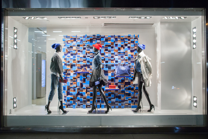
The window display above is featured at an Armani Exchange store in New York City. This display stuck out to me right away by the background. It shows the color blue and adds value to add a variety of blues. There is a strong unity between the mannequins and the display. There may be a lot going on but it has balance. It is clean and well thought out. It provides rhythm with the mannequins walking the same way. The props in the background are all placed at different levels but in balanced way which enhances the merchandise. Armani is a clean, crisp, designer brand and this display enhances the stores image.
The Bad
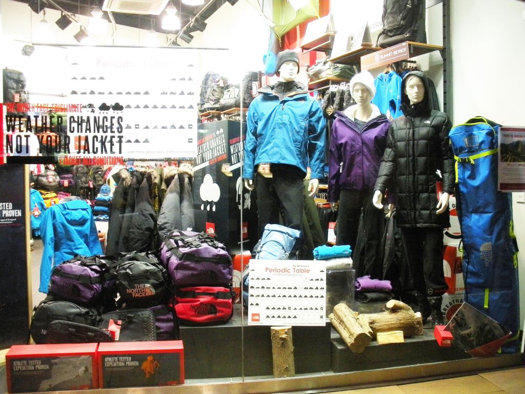
This display looks like it could be seen at a North Face Store or a Dick’s Sporting Goods. The first thing that throws me off while looking at the display is the clutter. There is way to much negative space. There needs to be more balance. There is random items placed throwout including the logs which don’t fit in. This display could improve simply by just grouping things together and putting out less items so it doesn’t look so cluttered. Also, there isn’t really a theme and the colors don’t flow together. This display won’t catch anyones eye or persuade someone to go into the store.
